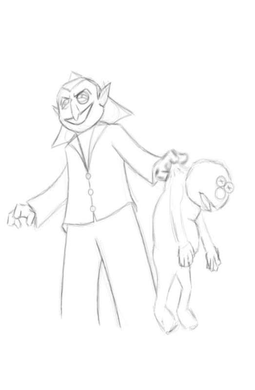
 This was my piece for a weekly sketch group. The subject was the Count. This is just the first thing that popped into my head. CLICK HERE to view the larger image.
Tuesday, June 23, 2009
The Count And Elmo
Saturday, June 20, 2009
Boba Fett
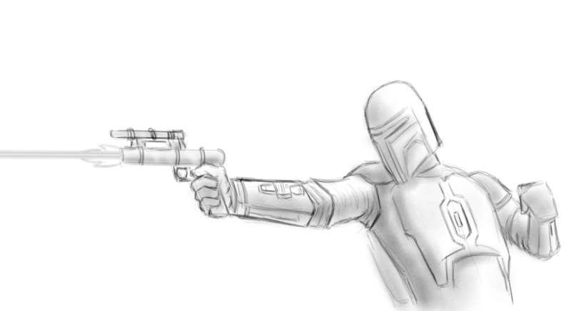 And one more Star Wars sketch today - Boba Fett. Again, I used a photo reference for this. There are a few changes including the blaster.
CLICK HERE to view the larger image.
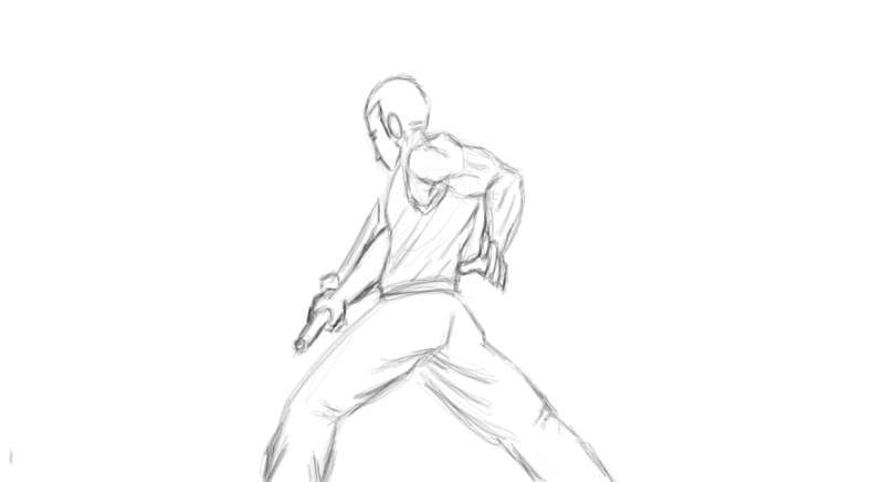
Yoda Fighting
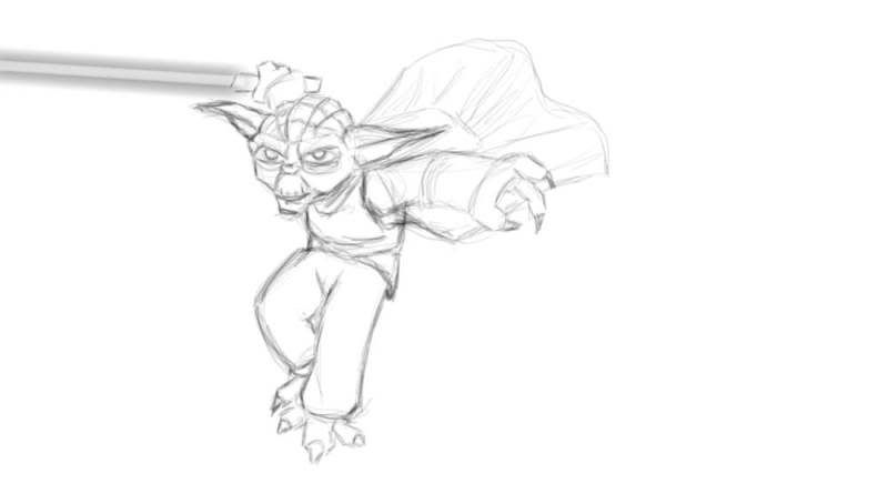 Here's another Clone Wars Yoda done from photo reference.
CLICK HERE to view larger image.
Yoda
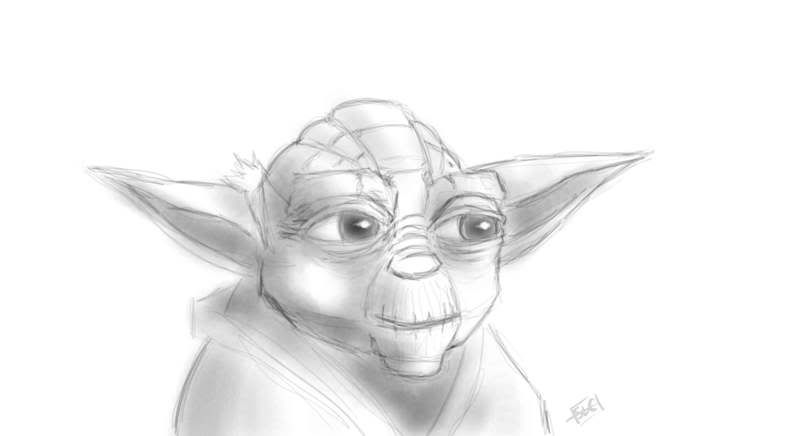 I used a photo reference for this. It's the Clone Wars version.
CLICK HERE to view larger image.
Tuesday, June 16, 2009
Kung Fu Theater: The Shaolin Temple
It's been so long since I saw 'Shaolin Temple' I'd forgotten how fucking good it is. It's a little weird watching Jet Li when he was so young (this was his first movie)
When you watch this film, and then go back and watch 'Fearless' (his last true Kung Fu Epic) it's amazing to see how far he's come as an actor and martial artist. Especially considering how good Shaolin Temple is.
I think Shaolin Temple is one of my favorite Kung Fu flicks mostly because it's action-packed from start to finish, but it's also a great story.
Read More......
Monday, June 15, 2009
Kung Fu Theater: Fist of Legend
I was going through all my old Kung Fu movies on DvD the other day and pulled out about 35 that I hadn't seen in a long time, including all 5 Bruce Lee flicks - please don't tell anybody! Ironically, the first one I watched was 'Fist of Legend', a remake of the Bruce Lee classic Chinese Connection (The Hong Kong English title was 'Fist of Fury' which was also the American title of his first feature film titled 'The Big Boss' in Hong Kong)
One of the things that really stuck out to me that I'd never really noticed before was that the fight scenes aren't really that spectacular. For the most part, they're pretty tame compared to a lot of his other movies.
The lone exception is this fight (the video says vs "Uncle Noh" - that's a mistake) in which he faces off against Funakoshi About half way through the fight they put on blind folds to even things out after Funakoshi gets dust in his eyes.
It's a phenomenal example of fight choreography. That fight scene alone makes it worth watching, but it's also a good story and a generally good movie. I had to put up with the poor English dubbing because my DvD doesn't have the original language for whatever reason, but I've grown an immunity to that after watching so many translated movies over the years.
Thursday, June 11, 2009


Wednesday, June 10, 2009
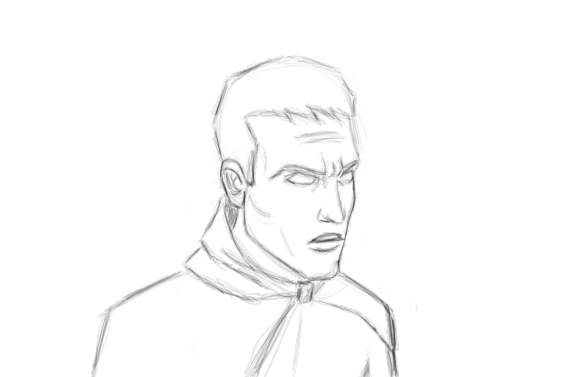
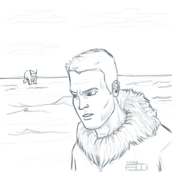
Jedi Knight
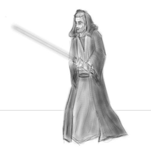 This is complete and utter garbage. For some reason, nothing I do lately turns out the way I want it to (aside from Star Stream) It's either too dark, too sketchy, too flat etc., etc.... I do like the way the lightsaber turned out though (at least the blade anyway)
Nephew
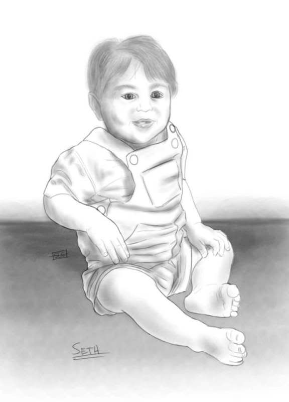 THIS IS A TRACE!
This is my nephew Seth. He's 15 months old now but this picture was taken several months ago. I used pencil brushes in Corel Painter and traced over the image. I put the pen's pixel size up to about 100 to do the shading. I'm not adding this to the 'ART' list (to the left) because it's a trace.
T-Rex
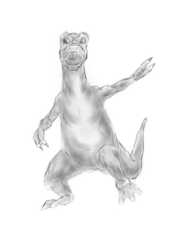 I don't know what the fuck he's doing. When I started drawing I was gonna have him ripping something apart but I didn't like the way it looked so I didn't bother to add anything. It looks like he's waving though... maybe dinosaurs are friendly before they eat you?
(CLICK THE IMAGE TO ENLARGE)
Friday, June 5, 2009
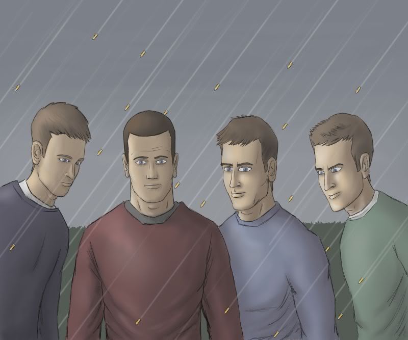
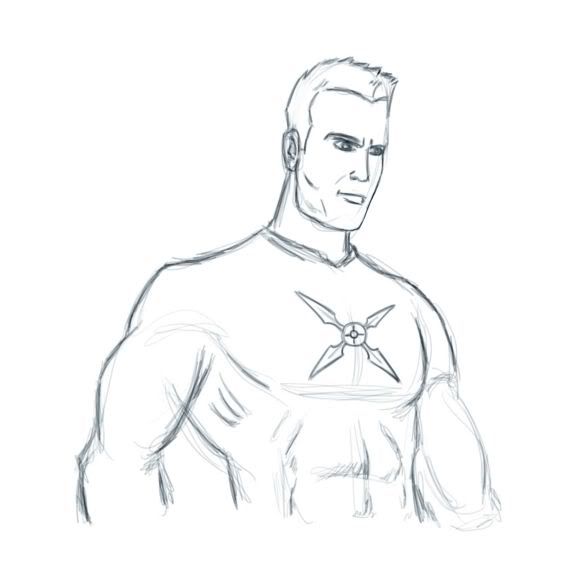
General Grimm
![]() Here's a larger version of panel 2 of today's Star Stream page. (click the thumbnail or "read more" to see the larger file)
Here's a larger version of panel 2 of today's Star Stream page. (click the thumbnail or "read more" to see the larger file)![]()
Thursday, June 4, 2009
Review: Terra (Sci-Fi)
'Terra' is a sci-fi webcomic by Holly Laing and Drew Dailey.
'Terra' features some great art and a story that evokes the Colonial genocide of Native Americans on a galactic scale.
It's 2309 and the United Earth Coalition is using their military force to wipe out alien civilizations to make room for human colonies. The main characters, Grey O'Shea and the alien Agrippa, are recon specialists for the Resistance - an organization of alien refugees and a few humans.
You'll pick up on the comparison of early American settlers waging war on native Indian tribes fairly quickly. But there's also a subtle comparison to modern military conflicts (and not just American) that I'm not even sure the creators intended.
Following the narrative of Grey O'Shea - an infantry soldier turned member of the Resistance - you see what happens when a Soldier comes face-to-face with the reality of how his Government is using him. If there's a side effect to this method it's that we only see Agrippa's motivations through O'Shea's perspective as opposed to seeing it through his own eyes.
The art of 'Terra' is great. For the most part, the character designs, vehicles and architectural designs are pretty standard for a futuristic sci-fi universe. My favorite part of that is probably the design of Agrippa. He's an Azatoth - an alien race that looks like a cross between a Klingon and a Jaffa (More specifically the Anubis Guard)
The only thing missing from 'Terra' was a good action scene. We get to see a little bit of the war in the first handful of pages, but not nearly as much as I'd like.
Minor complaints aside, 'Terra' features some interesting characters in an intriguing situation. 4 stars.
Read More......
Wednesday, June 3, 2009
Review: The Last Werewolf
In a future city, the adventures of a female bounty hunter and a mysterious detective.
_________________________________________
It''s unfortunate that the potential in 'The Last Werewolf' is buried by the terrible English translation. Otherwise the art, characters and setting all look good.
The manga style art is well done here. The characters look good, especially the female character. The black and white colors kinda remind me of a minor league version of Road with a wider range of contrast.
The problem with 'The Last Werewolf' is the English translation. Usually when foreign creators do comics with English dialogue the translation is a little off, but here it's a lot off. It gets to the point where it's too much of a distraction to enjoy the story. You think the character just said something witty, but you can't be sure if what you read is what was meant to be said.
It's a shame that such a good looking webcomic takes a hit for poor dialogue. 3 stars.
Tuesday, June 2, 2009
Review: Sidewise (Zuda)
When Adam Graham traveled back in time to Victorian London, he never dreamed he’d be fighting for his life against robots, science-sorcerers, a ruthless state assassin and a dead Queen’s brain!
_________________________________________
I can't find he right words to describe how incredible this webcomic is...
Every now and then I'll stumble across a steampunk story and wonder "why aren't there more stories like this?" It's a sub-genre that doesn't get enough attention. So it's nice to see a steampunk webcomic on Zuda, even better when the writer is a recognizable name in comics.
The story is set in an alternate 1902 London where robots patrol the streets killing anybody out past curfew. It centers around a witty 15 year old son of scientists who travels back in time to this alternate reality. He's an instantly likable kid in the traditional underdog role.
When the robots try to kill him for being out past curfew he's saved by two more very likable characters. This is where the real steampunk element comes in.
The artistic style is a perfect match for the steampunk world these characters live in. It's highly stylized with nearly perfect dynamic shots that accentuate the action (which there's plenty of) The consistent use of earth tones makes perfect sense in this comic.
By the time I'd finished reading 'Sidewise' I'd already made up my mind I was gonna vote for it this month. The only thing that would change my mind right now would be a steampunk story set in space with Bruce Lee as the main character... so unless there's one of those... no? (5 stars)
Review: Kogoshii (Zuda)
Hell hath no fury like a woman scorned. Two young lovers born to rival clans, a secret affair turned to political capital. A pure love begets blinding hate; a broken heart’s lone solace is vengeance.
_________________________________________
The plot of Kogoshii is a tried and true story of two lovers from rival clans. It's as cliche' as a martial arts film about a gifted fighter seeking revenge for the death of his teacher, father, brother, girlfriend... pick one.
The biggest difference between Kogoshii and the traditional stories is that it's set in the future... or an alternate reality. It's really not clear which one it is.
That's not the only problem with Kogoshii. There's some extremely flawed logic like why the two characters would be so depressed by the fact that they're clans (who have been rivals for centuries) decided to forge an alliance and allow them to stop hiding their love and marry each other as a symbol of the two clans' union. It's an illogical step for them to take considering just a few pages earlier we're told they would sneak off to share their clan-specific skill sets with each other.
The old school black and white art probably made the biggest impression on me. Despite being less than perfect, there's something there that I can't put my finger on. Maybe it's perfection through imperfection. There's also a lot of emotion in the expressions.
Overall it's pretty good but I only gave it three stars because the illogical reaction from the two main characters didn't work. It's obviously done to move the story from point A to point B but it does this at the expense of character consistency.
Read More......
Review: Fallen Hunter (Zuda)
Life grows harsh in 2020 where killing and hunting have been major tasks in daily life so to survive. "Desert Hunter" captures a tough one among them, giving you a smashing visual impulse.
_________________________________________
Fallen Hunter bares it all on Zuda... Fallen Hunter may be your typical post-apocalyptic webcomic, but it's packaged in some great art with interesting characters.
The art on 'Fallen Hunter' is excellent. The backgrounds, character designs, vehicles... everything looks great. The only flaw in the art is the poses. They lack energy and it hurts the final product.
By the end of the story I was left wanting a few more pages to see where this was going... both story-wise and literally. I wanna know where these women are taking him. As good as the designs looked, I'd love to see what this city looked like.
There's a little bit of backstory about what kind of world the characters live in, but the story could've benefited from a little more explanation. The extensive action sequence did more to derail the overall story here than anything else.
One major flaw was the dialogue. I'm guessing English isn't the creator's native language. There were a few places where it really stood out but overall it wasn't that distracting.
I gave 'Fallen Hunter' four stars because despite a few flaws, the parts it got right it did exceptionally well. I could've done without the nude shots but I think I can look past that.
Subscribe to:
Posts (Atom)

